
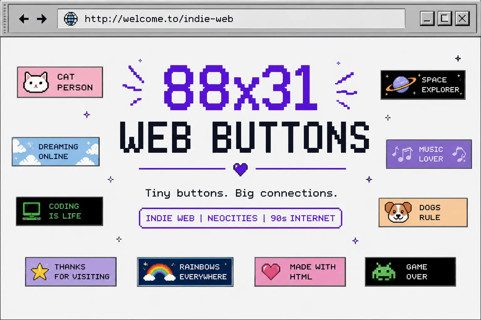
An 88×31 web button is a tiny image that is exactly 88 pixels wide and 31 pixels tall, the website owners mainly used them for display and trade to link to each other’s sites. The idea of this came in 1995 from Netscape advertising badges and was adopted by GeoCities homesteaders afterwards, and it didn’t die. Today it’s the signature calling card of the Neocities and indie web revival, where people still collect them on button walls and swap them the same way kids once traded pins.
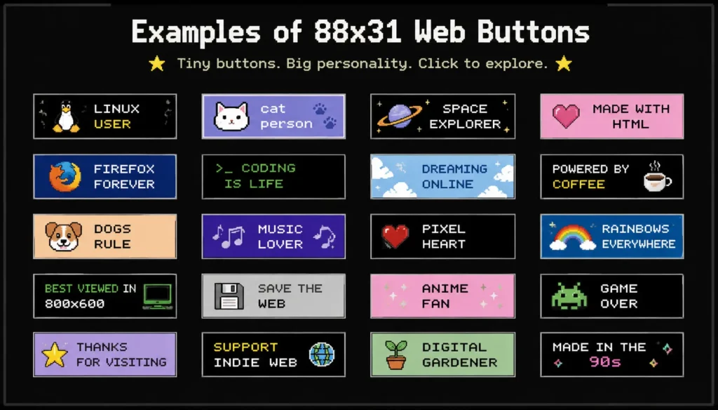
Table of Contents
What 88×31 Web Buttons Actually Are
Picture of a small rectangle, smaller than a browser tab icon, barely bigger than a large emoji, carrying a name, a mascot, or a joke, usually as an animated GIF or PNG. The mainly we saw them on websites is in the footer or the sidebar, sometimes called a button wall, and each one links out to the site it represents. It’s the low version of blogroll. Instead of reading a list of names, you scan a row of tiny pictures.
The format shows up constantly on personal websites hosted through Neocities, and it can fit naturally on blinkie websites and fan shrine websites. Made by hand rather than generated by a template or AI creation. I even once got confused about what the difference is between blinkie websites and 88×31 web button websites.
Where the 88×31 Size Actually Came From
When I research this, I notice that most explanations stop at “it’s a 90s thing,” but the real truth is better than that.
The size traces back to Netscape’s 1995 Netscape Now! promotion, which rewarded webmasters for displaying an “authorized” browser badge on their site. In the Wayback Machine, the website shows that the button appeared on Netscape’s own site in 1995, and GeoCities picked up these in 1996. Buried in Netscape’s own usage guidelines from that era is a small inconsistency that’s easy to miss. The real truth is the measurement of this Netscape specified was not 81×31; it’s 88×32. Later, everyone copied from it and measured 88 by 31. Nobody seems to have needed permission to riff on the “sample” size, so the 31-pixel spread was better than the 32-pixel one.
By 1998, the format had become common enough that the Interactive Advertising Bureau formally listed it in its ad size recommendations as the “88 x 31 Micro button”. And it sits alongside the once dominant 468×60 banner. For a few years, this wasn’t just a hobbyist quirk. It was actually an industry advertising standard, used by big tech giant Microsoft.
The Indie Web’s 88×31 Revival
The shutdown of GeoCities didn’t mean the format disappeared. It shifted into communities built around Neocities, the modern successor to GeoCities-style personal hosting, treating 88×31 buttons as a core piece of site culture rather than a relic. People are building new buttons by hand. Most creators follow the old style with their creativity side also.
This fits neatly into the broader indie web revival happening right now. People are busy building digital garden websites, and now pages are frequently the same people trading 88×31 buttons in their footer. Current websites show some social media icons in the footer, and in the 1990s, the icons were 88×31 web buttons. Large public archives, some cataloguing tens of thousands of buttons pulled from old GeoCities snapshots, exist specifically so today’s website builders can study or riff on the originals.
What Makes a Good 88×31 Button
There’s no strict rulebook on this, but a few conventions show up again and again across the community. Text usually stays short because of the 31-pixel size. Pixel art styling, with hard edges and a limited color palette, tends to read as more authentic to the format than smooth, anti-aliased graphics, even though nothing actually requires it. Many of the buttons featured a mascot tied up to the site owner’s identity, and most of them saved as GIF or PNG style to animate.
Some community styles also differ. Buttons from Neopets-era pet sites tend to use softer, painted edges, while Neocities-style buttons lean toward flatter pixel art, 2 visually distinct traditions that grew up around the same 88×31 frame without much overlap between them.
Button Etiquette on the Indie Web
When these buttons are traded informally, a loose button etiquette has developed around them. Most of the owners host their own button file rather than hotlinking to an image on someone else’s server. Adding someone’s button is usually treated as a small public endorsement, so people will put buttons where they like most. Another one is Reciprocal linking; that means two site owners swapping buttons directly with a mutual understanding, somepeople will give the site without any expectation. When the button is given on the website, giving credit to the original artist is a good method.
This method grew up around internet webrings, another link-sharing tradition from the same era that’s seeing its own quiet comeback.
How to Make and Add Your Own
You don’t need big software to get started; tools like GIMP or Aseprite work well for pixel art. There are even multiple websites where you can build these for free.
Once you get the image, the simplest way to add it to your footer or sidebar image tag linking to the site it represents. If you need to display the page header section, just add it to the rel icon option with a sizes attribute set to 88×31; no special new markup required, just standard HTML repurposed for the job. The IndieWeb Wiki documents this markup approach in more detail for anyone building their own site from scratch.
Where to Explore More
Now, several long-running archives preserve tens of thousands of original and fan-made 88×31 buttons pulled from GeoCities snapshots and personal sites; it can gives you worth browsing rather than making your own. They pair well with a broader look at the golden era of Flash websites and the personal homepage era, two other corners of the same design period.
The Takeaway
In my opinion, the 88×31 button survived for one simple reason. It was never really an ad format at heart, no matter how briefly the industry tried to claim it as one. Some people, it was a personal one, small enough to make in an afternoon, easy to trade like a sticker, and expressive enough to say something about the site behind it. That’s the exact reason why a new generation of Neocities and indie web builders picked it back up instead of letting it stay buried in a GeoCities archive.

Asif BC is a web developer with 2 years of professional experience in website development and modern web technologies. As the creator of Curiouxify, he researches and writes about interactive websites, internet history, browser experiments, digital culture, and the evolution of the web. His articles combine technical knowledge with careful research to document the creative and lesser-known corners of the internet.